Inventing a business name and logo
I’m always intrigued about people’s business names and logos, so I thought I’d write a post about mine!
The ‘Truependous’ part of things came about because my surname is Truepenny and when I was at school, my nickname was Queenie Truependous (don’t ask why about the Queenie part as I genuinely have no idea haha!) but that was the obvious choice when setting up the businesses.
Like Roald Dahl, I am a MAHOOSIVE fan of invented words! Sometimes, real words don’t quite hit the nail on the head. I love how Truependous is an amalgamation of Truepenny, tremendous and stupendous – all of which the definitions are very apt! With the exception of ‘inspiring dread’ !! Let’s hope not anyway!
tremendous
adjective
1. very great in amount, scale or intensity
2. ARCHAIC
inspiring awe or dread
stuependous
adjective
extremely impressive
A series of Truependousness
So, the first project in the ‘Truependous’ series, was Truependous Times Tables, a site I put together to support staff at my school, and across the world, with teaching maths. When I was appointed maths leader in 2017, my main drive was on times tables, and how this skill could be incorporated within all areas of the maths curriculum.
Visit the Truependous Times Tables website
Visit the Truependous Times Tables Facebook page
Next came Truependous Travels. This started as an Instagram and facebook page when my husband and I bought our bright orange VW crafter back in October 2018. We set up a YouTube channel under the same name to upload van tours and various videos involving Bob.
Visit the Truependous Travels Instagram page
As I have a love of alliteration (who doesn’t?!) it was easy naming the tutoring business – Truependous Tutoring. I could have called it Truependous Teaching but in the end went for the former option.
Visit the Truependous Tutoring instagram page
Next, came naming the childminding business. We wanted them all to link, so it was, again, a fairly obvious choice going for Truependous Tots. The only problem is, now we actually have quite a few 7+ year olds on the books, and calling them ‘tots’ doesn’t really work! So as the business evolves, it will need a new name!
Visit the Truependous Tots Instagram page
About the logos
When I started the tutoring business, I had an idea that I wanted two puzzle pieces to feature on the logo, as to me, teaching and learning is all about making links and connections.
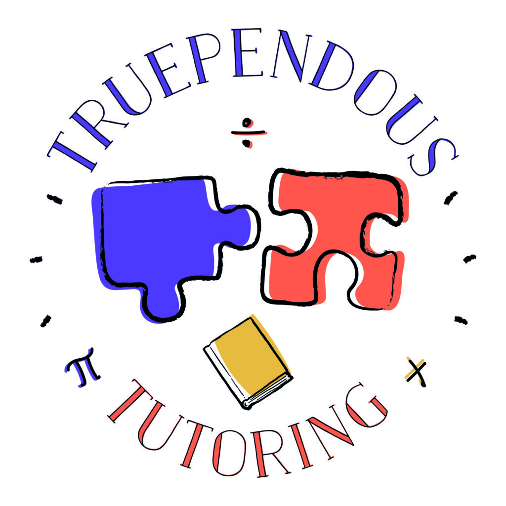
I asked one of my old school friends (and opposite-door-neighbour) who is a graphic designer (Paper Cactus Prints) to create the logo for me and below is the final product! I like how the puzzle pieces are coloured outside of the lines as this represents thinking outside the box, and being creative. Then there are the three maths symbols as I was a maths leader in my last teaching post. I definitely wanted a multiply and divide sign and the graphic designer put in Pi aswell, and because Pi is exceptionally cool, I decided to keep it haha. As all my lessons are focused around either maths or English, I wanted to make sure the logo showed that – the book underneath represents English.
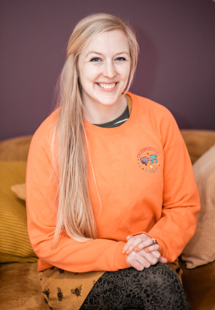
I then went to my local embroidery shop who digitalised the logo and then altered the colours so it would stand out on an orange coloured sweatshirt.
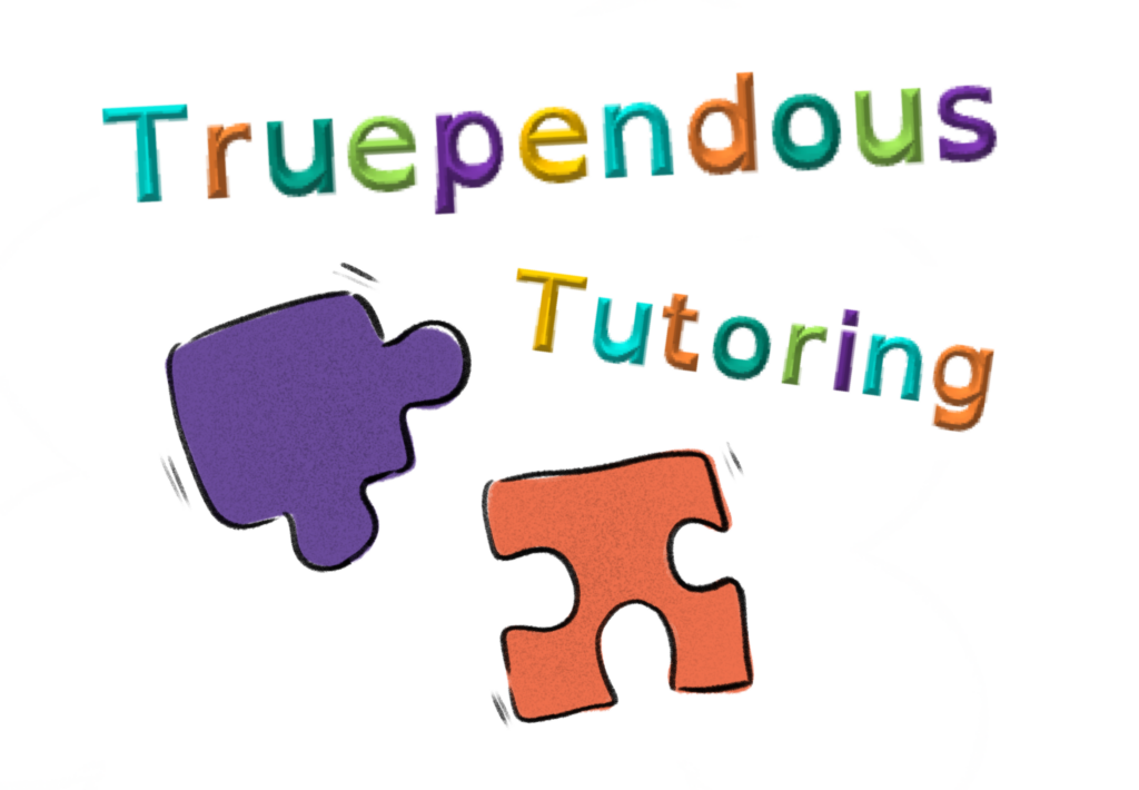
I’ve had this logo now for two years, and as the business has evolved, I feel it’s time for a bit of a revamp! I’ve been thinking about having it more ‘cartoony’ to match the vibe of my website and Lemon Disco Design’s fabulous illustrations. This is my very rough re-vamp idea, but I think I want to have a computer with the puzzle pieces on the screen. I’m going to leave this with Lemon Disco Designs and see what magic she can make! I’ll update you in a future blog post!
Colour scheme
The colour scheme is really important to me, as I have a colour scheme for my entire life! This is reflected over my whole website – orange, purple, mustard, teal and lime green. Hence why I want the words Truependous Tutoring to also reflect the colour scheme.
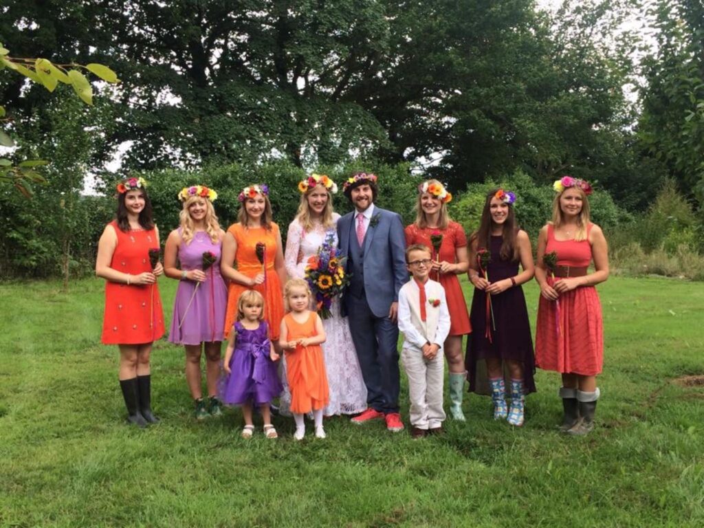
When I got married, my colour scheme was purple and orange, as I think they are the best colour combination possible, hence being the main colours in my tutoring logo.
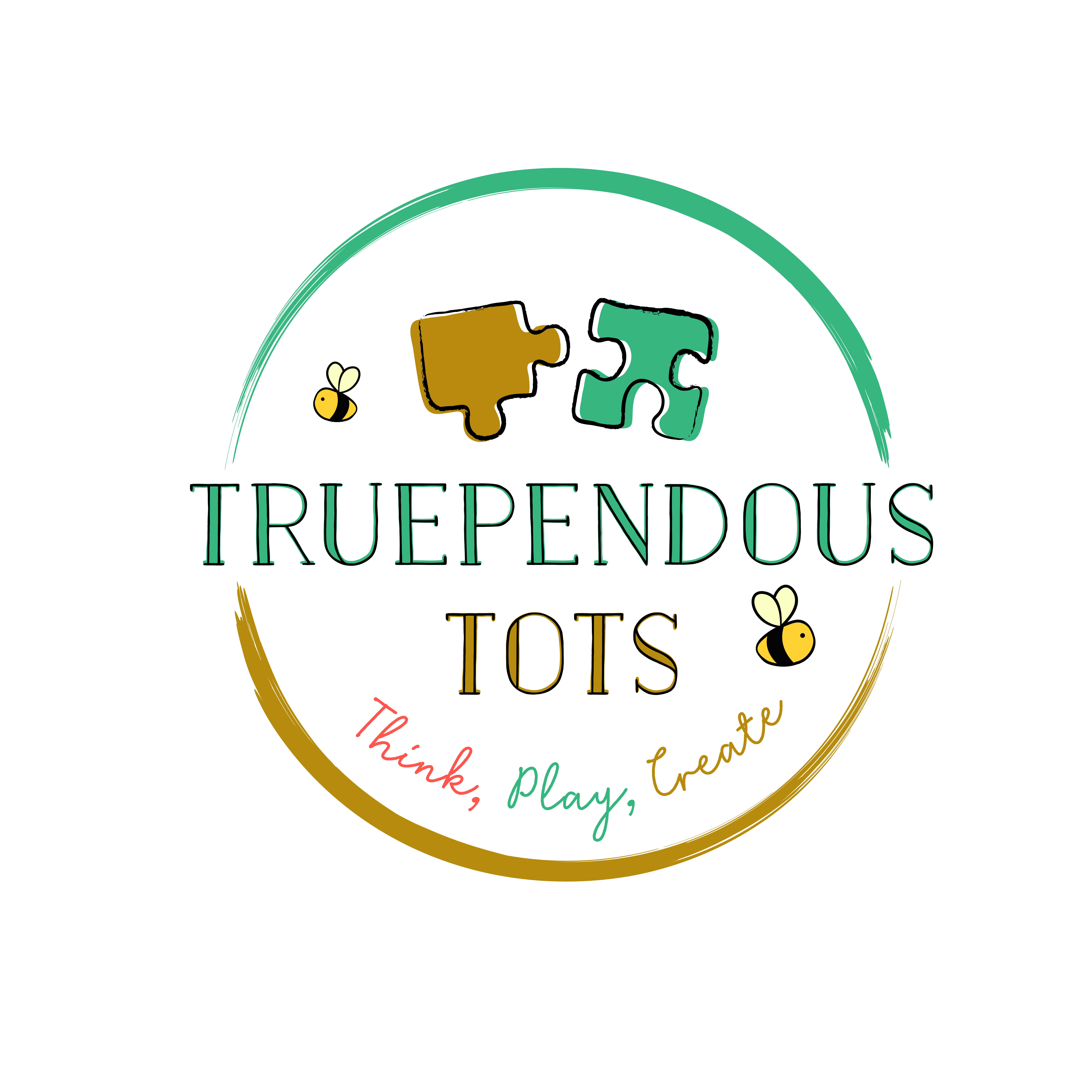
Back to the blog. So, once my tutoring logo was done, next up was Truependous Tots. I chose colours from the colour scheme of my life again as you can see! I also wanted the puzzle pieces to feature again, for continuity. ‘Think, Play, Create’ is the slogan and then the brush marks at the top and bottom are to represent mark-making and creativity. The bees are there because we adore bees (and our daughter’s middle name is Bee) and also because bees are busy!
How did you come up with your business name and logo?


One Comment